Big screens
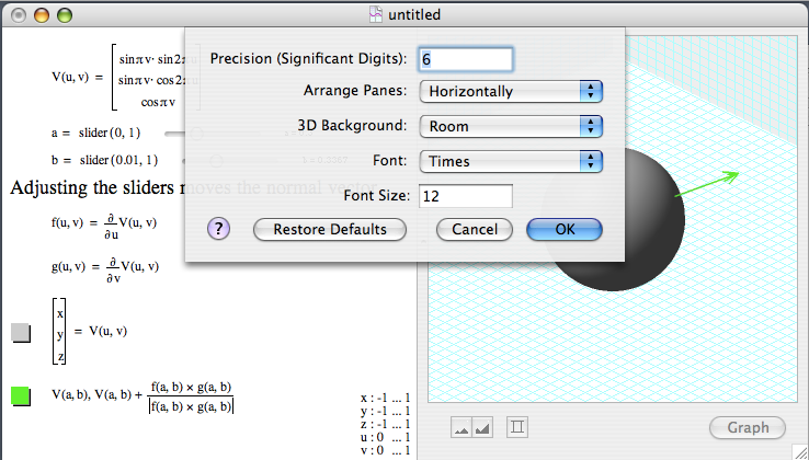
The visual interface to GC is designed to focus attention on the math with a minimum of distracting window dressing. The graph and equations are in the same window to keep them tightly coupled in the users mind, that they are both just different representations of the same underlying objects. Now that wide monitors are common for viewing DVDs, I've added the option shown below to make better use of space with wide but short windows.
It needs a better descriptive name for the preference, though. Anyone have any suggestions?

Comments
'Compact [...] dialog'?
Posted by: Scythereal | November 23, 2006 01:48 AM
One suggestion might be:
Show graph: [Below equations / To the right]
Posted by: Billy Kakes | November 28, 2006 02:10 PM
Thank you! That is much better.
Posted by: Ron | November 28, 2006 02:18 PM