User Interface Perfection
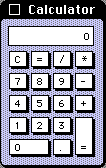 Consider the Calculator Desk Accessory on the original 1984
Macintosh System 1.0. It is easy to use and easy to learn. The
interface is self-revealing: it requires no documentation and no
instruction. It is obvious at a single glance both what it is capable
of doing and how to do it. Equally importantly, its limitations are
as obvious as its functionality. No one will waste any time trying to
coax it to do anything which it was not designed to do. Every
designer should strive towards these qualities.
Consider the Calculator Desk Accessory on the original 1984
Macintosh System 1.0. It is easy to use and easy to learn. The
interface is self-revealing: it requires no documentation and no
instruction. It is obvious at a single glance both what it is capable
of doing and how to do it. Equally importantly, its limitations are
as obvious as its functionality. No one will waste any time trying to
coax it to do anything which it was not designed to do. Every
designer should strive towards these qualities.
Software design is an art of compromise between competing and contradictory criteria. Users want more features. They do not want to read manuals. They want inexpensive (or free) reliable software. The tension between functionality versus ease of use and ease of learning is eternal. Marketing and Sales want more features to sell products. Technical Support wants the current features to be reliable and easy.
The design space is multi-dimensional. Each application sits on a point in that space chosen as a tradeoff amongst the competing criteria. Within the limitations of what it set out to do, in the context of computer users in 1984 who had never before seen a GUI, Calculator 1.0 achieves an ideal in terms of ease of use and ease of learning.
When writing Graphing Calculator 1.0, we aspired to the same usability while increasing the functionality. We made compromises along the way, but it helped to remember the ideal we were striving for, even as we failed to reach it.
Comments
It's perfect for a 6 year-old, but that's about it.
Posted by: Eric | August 16, 2006 11:32 AM
How did you activate RPN mode on it :-P
Posted by: Eric | August 16, 2006 03:57 PM
Eric's comment is similar to mine; the UI is good given that it acts like a cheap calculator, but it is wrong for most uses.
3 + 4 * 7 =
doesnt't give 31 like you'd expect, but 49, since the calculator has no notion of operator precedence. While it's true that cheap calculators don't either, well, no computer of that era was 'cheap', and folks who paid $2k for a computer might expect it to do the right thing.
Really sad to me is that even today this isn't fixed -- I don't know of any personal computer which ships a calcularot which does natural order evaluation of entered equasions.
Posted by: Keith Stattenfield | August 28, 2006 05:12 PM
I'm not really sure if the calculator interface is intuitive, or just familiar. I bet there are better interfaces, but the mindshare is impossible to fight.
BTW, I've heard a lot of people talking about "as easy to use as a pencil". I have kids. Pencils are hard.
Posted by: Avi Rappoport | August 30, 2006 03:19 PM